
|
 historical historical
 ubuweb ubuweb
|
The Fox, USA | 1975-6 
 Issue 1 [5mb. PDF] Issue 1 [5mb. PDF]
 Issue 2 [41mb. PDF] Issue 2 [41mb. PDF]
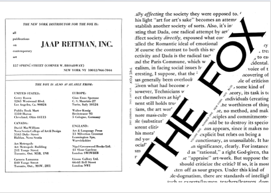
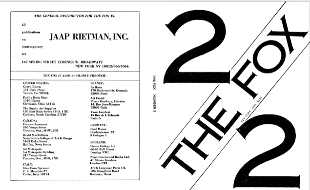
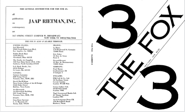
 Issue 3 [60 mb. PDF] Issue 3 [60 mb. PDF]The Fox Country: USA Founded and folded 1975–6 Key contributors: Sarah Charlesworth, Michael Corris, Preston Heller, Joseph Kosuth, Andrew Menard, Mel Ramsden The Fox magazine was born out of conflict, lived on a diet of rancour and bitterness, and was finally snuffed out by a surfeit of animosity. Its three issues, published between 1975 and 1976, contain some of the sharpest art writing of the period. Notable Fox scalps include the Whitney Museum of Art’s exhibition ‘Three Centuries of American Art’, which was attacked for its blatant support of existing power élites. However, over time the editorial veered toward attacking its own rather than its enemies. Instead of feasting on sacred cows, The Fox appeared to prefer gnawing at its own tail. The first issue was edited by Sarah Charlesworth, Joseph Kosuth, Michael Corris, Andrew Menard, Preston Heller and Mel Ramsden – all members of the New York wing of the art collective Art and Language, which at the time was breaking away from the UK branch in a viciously public fashion. The argument ostensibly concerned the scope of their concerns, but rumour has it that it was more personal than political. The publication opened with an invitation: ‘Those who are interested, curious, or have something to add (be it pro or con) to the editorial thrust […] the revaluation of ideology […] of this first issue are encouraged, even urged, to contribute to following issues.’ Although commendable, The Fox’s willingness to acknowledge the ‘con’ was to prove fatal. When the artist–activist Karl Beveridge wrote a piece for issue 2 accusing Donald Judd of perpetuating ‘the Big Cultural Lie’, he was actually making a veiled attack on Judd acolyte and Fox mainstay Kosuth. The publication could not survive the fall-out. In an article written for the final issue, titled ‘Lumpen Headache’, Peter Benchley characterized the situation as ‘relentless psycho-drama’. The Fox does not carry a design credit, but it is usually assumed to be the work of Kosuth. With its cardboard covers and newsprint interior the magazine makes a feature of its economy, but its typography, although simple, is extremely elegant. The covers display the issue number and the title, set diagonally in Copperplate Gothic. The same typeface is used in the interior of the magazine for headlines, and text is set in a straightforward two-column grid. Illustrations are used sparingly – there are no reproductions of art works – but to great effect. The Fox may have been a savage beast, but it was ever so sleek. -- Frieze |