| << UbuWeb |
| Aspen no. 3, item 8 |
|
|
| 12 Paintings from the Powers’ Collection |
|
James Rosenquist |
||
|
Bridget Riley |
||
|
Gerald Laing |
||
|
Roy Lichtenstein |
||
|
Kenneth Noland |
||
|
Andy Warhol |
||
|
Claes Oldenburg |
||
|
Larry Poons |
||
|
Jasper Johns |
||
|
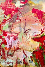
William deKooning |
||
|
Charles Finman |
||
|
Ernest Trova |
|
|
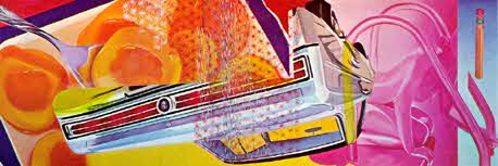
LANAI by James Rosenquist First of all, most of my pictures are about nonobjective art, although that does not mean they look non-objective. I use objects for the benefit of the viewer, to relate space and color. Since 1960, I have been concerned with the space that falls forward, out of the picture. This follows after the abstract- expressionist idea of an all-over-surface painting, as a wall. I am not interested in purity; I am interested in clarity. The objects in the painting are used to sustain a color and space idea, so that I am able to finish the painting instead of being guided by a passion at a particular moment. ""Lanai" is Hawaiian for front porch. — Rosenquist |
|
If you look for identifiable objects in this huge painting (it's 18 feet by 5 feet), you will find peaches, a spoon, an upside-down car, wallpaper, a nude girl by a swimming pool ladder, and part of a pencil. Art is not nature, and Rosenquist has not painted nature. This is not a painting of things. Once painted on the canvas, a peach becomes an artistic form. It has color, line, form, volume, placement, and spatial relation. The peaches are warm and luscious at one end; the girl, for all her shapely curves, is cold, metallic, faceless — thus impersonal. If you wish to interpret this as representative of modern woman — cold and impersonal — this is the "viewer participation" that is possible in contemporary painting. For all his Impressionism, Monet presented water lilies to you, and you were able to view them, but you did not participate with him in the painting. In Rosenquist's work, the viewer is always a co-participant. The longer you look at this painting, the more layers of personal meaning it takes on. By a combination of color and action and size, this painting keeps asserting its existence. Some skeptics say, "But it isn't restful!" Do you ask that your art be restful? The most restful place is probably a darkened room. The world around us is alive — full of planes and computer and rockets and television and can and radios and satellites! To live is to be involved in the world around us. "Lanai" can provide continual life and enjoyment.
— Powers |
|
""Straight or curved, horizontal or vertical, parallel or divergent, all lines have a secret relation to emotion" — from a statement by Charles Blanc. — Riley |
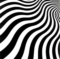
INTAKE by Bridget Riley |
|
Optical art is very much in vogue since Bill Seitz collected a show called "The Responsive Eye" at the Museum of Modern Art in New York, and then sent it on a nationwide tour. For my taste, the best artists of this school are limited to Vasarely, the father of it all, Larry Poons, Soto, and Bridget Riley. (Some of my favorites, such as Lichtenstein, Laing, Noland, and Stella, use optical effects wonderfully, but they are not primarily optical artists.) Riley is a tiny, bright, intense young woman with a passion for perfection in her work. She often makes many drawings of a planned work before she starts on her main structure, and I have long sought after some of these splendid drawings. ""Intake" speaks for itself. Since it is executed in black and white, it reproduces well. What one cannot feel in reproduction are its large size and the stark whiteness of the stretcher against the very black image. This painting moves constantly. The effect you see results from the image thrown on the retina of your eyes, and partly from parallax (the placing of our eyes by nature about two inches apart, so they do not see the same image at exactly the same moment). Like Poons', this work is active as your eyes scan it, but the method of creating the action is different. Some people ask, "Doesn't it make you dizzy? How can you live with it?" No, it doesn't make me dizzy, but it is always fascinating because it never gets lost on a wall, as many classical paintings do.
— Powers |
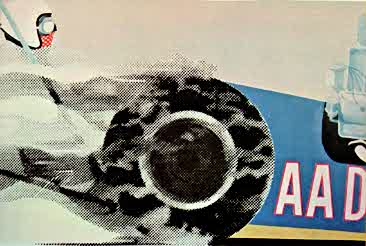
AA-D by Gerald Laing |
|
AA-D is an example of the very formal figurative painting with which I was involved in 1962-5. A painter whose work has always excited me is Paolo Uccello whose flat at formal depiction yet strong concern with objective fact influenced my work strongly. AA-D is a painting of a drag racing car, and while a naive comparison can be made between the drag racer and Uccello's mounted knight' it is more pertinent to note that the compositional possibilities are similar. Organic anonymity coupled with mechanical identity are common to troth. AA-D was painted in London, at a time when most of my contemporaries were entranced by a Utopian dream of an America they had never visited, but which we all envisaged, with Hollywood's help, as a classless (boon to the English) bright society full of an optimistic naivete which made all things possible and was typified by the gleaming exotic and extravagant playthings which were heavily propagandized in Europe. Of these, drag racing was the wildest. — Laing |
|
To select one of Laing's works presented many possibilities. His most recent work involves reflective metal parts and baked enamel, but I chose an earlier work with violent action, and one containing points for comparison and contrast with Roy Lichtenstein. Gerald Laing uses an image that we see many times a day, but usually are unaware of — the image of the Benday dot. If you look at any newspaper photo with a magnifying glass, you will find that what you see as a picture is actually an optical illusion, created by a varying density of dots. In printing, a screen is used that lets ink flow through in some places and not in others. Laing uses this image, but not the screen. He draws in each dot, and varies the size. By this combination of size and placement variation, he gets a feeling of intense activity and speed. Both are built-in factors in our everyday life, just as the newspaper is. So with a new application of what is a familiar image, a fresh and contemporary artistic statement is created.
— Powers |
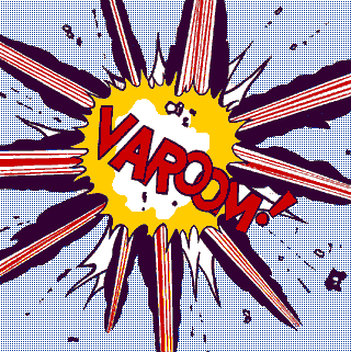
VAROOM by Roy Lichtenstein One of the things that interests me is solidifying an action, like an explosion— something that is ephemeral— formalizing or symbolizing it in concrete terms. Another interest is the visual representation of sound— such as "Varoom! !" Some call it "audio-scription." Explosions give me a perfect opportunity to do a completely abstract painting which seems, on the surface to he realistic. — Lichtenstein |
|
Lichtenstein also employs the dot image of the Benday screen. Like Laing, he does not use it in the variation of a Benday screen. Unlike Laing, he does not vary the sizes of the dots, but spreads them uniformly; and unlike Laing does not paint in each dot but uses a uniform screen to produce them. Thus Laing uses dots to produce motion; Lichtenstein uses different dots to produce rest. In "Varoom!" there is certainly a great punch of big action, but notice that the static dots provide the stationery background. The painting's action, its suddenness, and its violence are produced by a variety of elements — all the straight lines stretch out at wide angles from the action center. This creates a feeling of expansion in a 360-degree area that seems sudden and unexpected. The curving lines alongside the straight ones give the feeling that the dill space (created by the static dots) is being shoved aside. The jagged center lines are shattered and explosive; the word VAROOM! in its visual image, its unstable placement of letter, its onomatopoeic quality, all combine to produce action. Finally, the askew placement of the exclamation point and the tiny flying fragments finish off the action. So we have central action, emphasized by placement against static background.
— Powers |
|
|
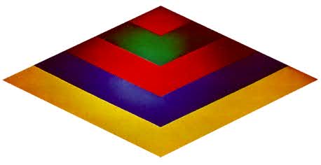
MACH II by Kenneth Noland I do not like to comment on my paintings, except to answer technical questions. To talk about my work just takes me into another realm of expression and gives me another problem to think about. I really can't think of anything to say that would interest me and I can't imagine that it would interest anyone else. — Noland |
|
Here is a giant painting, 17 feet on the horizontal axis of the triangle, 9 feet on the vertical. To hang it on a wall required the assistance of the builder of the house, who had to saw four inches from a beam. But it looks sensational! Noland, a colorist who worked with Morris Louis, has gone on to new dimensions of color and shape relations, both in the images he paints and the shape of his canvases. His arrangement of color in tone, shade, and quantity, as well as inter-relationships within his canvas, are continually exciting. Size alone works for the painting, but if the shape or color or image were wrong, size would be equally emphatic in making the work a woeful failure.
— Powers |
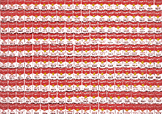
200 CAMPBELL SOUP CANS by Andy Warhol
|
|
Who wants to look at 200 Campbell Soup cans, 100 inches wide and 72 inches high — unless he is Mr. Dorrence or a Campbell stockholder? Of all the paintings I own, this is one of the most controversial. There is always the suspicion that I keep this painting for its shock value or its conversational appeal, or just out of pseudo-sophistication. Some more militant friends declare, "You idiot! Right now Andy Warhol is sitting at home laughing at you and how he's put one over on you." Well, I hope Andy is having a lot of enjoyment over this for whatever reason, because it's not his motive that really concerns me, but rather my own satisfaction I feel, however, that Andy is quite serious and sincere. The repetition, for example, has a rhythmic effect, and if you respond to rhythm and music at all, you simply can't ignore the power of this work. As you look, you become aware of a continuity that would not be possible in a smaller painting. There is also a variation that keeps your eye moving and comparing. You begin to see and then appreciate small differences. You see it as a modern landscape that was impossible in, let us say, the time of Watteau. It is true that you can go to a supermarket and see a similar image, but it is even clearer that one who owned a John Constable landscape had only to look out his window to see such a scene. The conclusion becomes clear. Art is not nature; it has a fully independent existence, and its success depends not on whether it pictures something else, but whether it makes a forceful artistic statement. As the philosopher Ortega y Gasset said, most people become so involved with the picture aspect of a painting (he calls it the John and Mary story of a work) that they miss the art involved. Listen to your friends talk about a painting — how right he was!
— Powers |
|
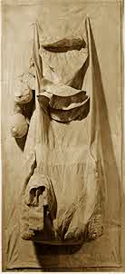
GHOST TELEPHONE by Claes Oldenburg The "Ghost Telephone" was a canvas sketch made for a vinyl piece (December, 1962). Some of the best things about a piece are never seen by the spectators and collectors, like the insides, the sewing, and the sketches. I felt this way about the telephone sketch in canvas, and went ahead and showed it (at swan Gallery, October, 1963). Since then, I have shown all-white, or "ghost" objects, which have become a class of objects in themselves. Associations have fastened to them: they represent, f.ex., the invisible proletarian effort that lies behind each glossy industrial object. They're of the realm of shades; they're skeletal, they're history to the vinyl present; they're ideal to the vinyl fleshy. Doubles — they haunt the Home. By an iron rule of trade, they're cheaper, because the goods are cheaper, even though they're closer to the artist's inspiration than the finished shiny object. Downtown objects. Like all my objects, this telephone is a fragment of the body. Like all the softies, a metaphor of the body, with insides and skin, and parts of the body Iying just the other side of identification. Myself, I think of the piece as a variation on a girl's torso, something left in my mind after looking at Brancusi's stuffed drainpipes. — Oldenburg |
|
|
This is more a sculpture than a painting, although it has some painterly qualities about it. And how can one maintain that the "John and Mary" aspects of a work are unimportant, when the artist puts it in front of your face in his title and carries it out in the work? The fact is that Oldenburg has used an object with nostalgic quality (as Jim Rosenquist did). This, then, becomes part of the statement by artistic intent. It carries with it some of our own thoughts about telephones — especially coin phones. It looks worn out. It looks beaten by those who did not have their coins returned; tired of conveying meaningless conversation and quarrelsome words. It is lifeless and carries the message of our society's continual obsolescence of objects. But aside from literary quality, this work has plasticity, shape in sculptural space, form, and texture. In these, it is an abstract form. Its line is reflected in continually changing internal shadows as the source or intensity of light varies. It conveys a feeling of limpness and old age.
— Powers |

REUBEN (as the Mississippi flows down to the sea) I can't think of anything right now, but if I do, I'll let you know. — Poons |
|
Imagine an "optical" painting, 13 feet high and 8 feet wide. It can surely be called a monumental work of art! This is an unusual work for me, because I watched its gestation. It started the way an architect starts a house — as a detailed plan on graph paper. Each ellipse or oval spot was placed on graph paper and given a number to establish the color relationships. Poons spent two months rearranging his plan and pattern on the large canvas. Sometimes I would walk into his studio to find him half-sitting on the arm of a wood bench, studying the unfinished work. He would tip and arrange a dozen high-intensity lamps, to get illumination as even as possible. Somehow it would not come off the way he wanted, and he seemed detached, almost disinterested. Toward the end of the second month, Poons phoned me and said, "I think it's finished." When I arrived at his studio, his attitude was entirely different — he was clearly interested. He liked the painting. And so did I. ""Reuben" is an optical painting, and so it dances before your eyes. The movement is caused by the relationship between the background color and the colors of the ovals and dots. But it is also active because of the variations in the colors of the ovals and dots, and their relative placement on the canvas. Finally, the canvas itself is so large you cannot see its entire surface at once. As your eye travels around the work it is continually interrupted by the irregular pattern, the irregular shape, and the color variations that your "color memory" cannot hold in true memory for you. This is really a "jumping" painting.
— Powers |
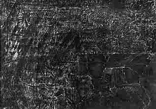
BLACK MAP by Jasper Johns I just made it like I make things. I really have nothing to say about it. — Johns |
|
Johns is one of the founders of the Pop Art movement. The term is loosely and often inaccurately applied in our urgency to understand by classifying, but the use of so commonplace a subject as a map emphasizes the popular image involved. The map, 44 inches high by 70 inches wide, is executed as a charcoal drawing except for the southeastern states that are done in black oils. It is necessary to look sharply to make out the names of these southern states. They seem condemned to anonymity as if their names were unspeakable. The names of the other states are clearly identified, but executed in a variety of lettering styles that are different in size, form, placement, and shading, a characteristic of Johns' treatment of letters and numbers. In the West, the faint form of a hand is seen, as though California has been touched by a divine hand — or perhaps a commentary on those who think this is so. The drawing area is sensitively shaded and textured with painterly strokes that often seem calligraphic. In addition to the calligraphic effect, an Oriental feeling is created by Johns' use of variation in the shades of black reminiscent of the Sumi ink painters of China and Japan, who recognize eight distinct shades of black. This master artist has created a work of intense interest.
— Powers |
|
WOMAN by Willem de Kooning The Woman has to do with the female painted through all the ages, all those idols. It did one thing for me: it eliminated composition, arrangement, relationships, light — all this silly talk about line, color and form... I think it had to do with the idea of the idol, the oracle, and above all the hilariousness of it — de Kooning in an interview in Location Magazine. — de Kooning |
|
|
The title "Woman" is descriptive of many of de Kooning's paintings of the last 15 years. Although they vary widely in size, texture, shape, color, and feeling, all his work concerns different aspects of woman, chiefly the sensuous. Some critics find a violence in these paintings; I see a lightheartedness and something bordering on both humor and joy. Bill once told me, "For hundreds of years, painter have been posing woman and painting her in the same way. A nude is posed barefooted, standing flat-footed and heavy on the ground, her hand on her hip and one knee bent. They did a wonderful job of that pose, and I don't want to paint it again. I think of a woman as being light, soaring upward, instead of attached heavily to the ground. I pose a nude in the highest heels made so she has an upward movement — then when I paint her, I leave out the shoes." ""Big Gains" has another dimension that de Kooning has worked with for years — it is painted on newspaper. In this painting, a one-column headline, "Big Gains Scored by Carolina Clan," and an adjoining civil rights article seem to have aroused a feeling of violence and the colors are bloody. A variety of other items show through the paint, all typically part of woman: There is an offer of merchandise for $9.99 (what woman was ever tempted by a $10 price?); a handbag clearly shows, and what woman ever goes anywhere without her handbag; significantly, the Births column shows through near the center of "Woman"; and the Deaths column ties in the violence of "Big Gains" and the inevitable end of man and woman.
— Powers |
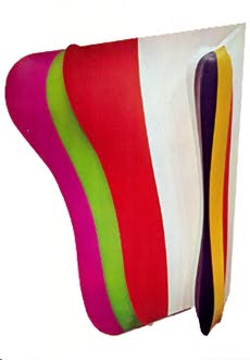
VERTICAL WAVES by Charles Hinman The painting, "Vertical Waves," is a key painting of a series that attempts to amalgamate the object-making tradition of the painter. I tried to make an object with a strong three-dimensional character that would relate meaningfully to the wall or the plane of the painter. Conversely, the painted illusory spaces, or bands of color, were to have a meaningful relationship to the object. There is also an attempt to relate two separate color systems in the same painting. The acid-like green, violet, and red range at the left of the painting has a certain emotional completeness in contrast to the more stable red, yellow, and blue range at the right. — Hinman |
|
This work is a large shaped canvas, about 7 feet high. An angular section on the right side is attached to the main section by a long piano hinge, and held in place at the bottom by a piano wire. Hinman derives from the Colorist school of Josef Albers and Morris louts, and seems, to me, to relate also to Ellsworth Kelly. But he brings a new dimension by working on firmly constructed, beautifully undulating, shaped canvas. ""Vertical Waves" can be classified as a painted sculpture. The colors alternate — red on the left; yellow, right; green, left; blue, right; violet, left — the alternate grouping separated by a white field. As the observer moves from side to side, both the amount of any color he sees and the shape of the space it inhabits are constantly changing. Hinman therefore has a many-sided problem of presentation, much as a sculptor does. The result in "Vertical Waves" is magnificent, even in a photograph.
— Powers |
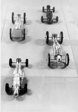
WHEEL MEN by Ernest Trova No comment. — Trova |
|
Trova's anonymous figures reflect our times and our attitudes. By contrast with the shaggy figures of Rodin and the nervous, emaciated men and women of Giacometti, Trova's smooth, highly polished, faceless men belong to a scientific age of streamlining, space, and technology. I disagree with two of my friends, both deeply involved in the contemporary art world, who see Trova's work as too antiseptic, too facile. In a great book, "An Untitled Epic Poem on the History of Industrialization," one of the leading men of our time, R. Buckminster Fuller, identifies man's tools as extensions of his arms, and man's automobiles and thus his highways as extensions of his legs. The concept of wheels as part of man conveys a sense of man's advance — or of his end. The literary message is part of Trova's imagery, but by no means all of it. The spatial relation between the lines of the figures weaves an interesting pattern against the circles and straight spokes of the wheels. The reflecting surfaces of the bodies bring the environment and the viewer of the moment into the work itself. This gives constant motion and a feeling of the immediacy of the figures existing here, in this place. And at night, when the figures are lighted, they throw fantastic shadows. The bodily attachments of anonymous devices are both sculptural and psychological in the feelings they invoke.
— Powers |
|
Original format: Twelve cards, 8-1/2 by 6 inches, with the painting reproduced on one side and comments on the reverse side, enclosed in a die-cut folder. |
|
|
|
|
|
|
|